Related Posts


Podcasts


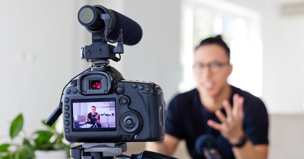
Ever found yourself relentlessly scrolling through YouTube, only to have your attention arrested by a single, striking thumbnail that practically demanded you to click? The thumbnail is the first thing a user sees on YouTube and is the difference between a potential buyer clicking through and discovering your content or scrolling past.
The question then becomes: How can you craft that irresistible thumbnail and get more potential buyers to click on your videos?
You’re in the right place for answers.
As an experienced content strategist who’s navigated the choppy waters of online marketing, I’ve amassed a treasure trove of insights and strategies – particularly when it comes to thumbnail creation.
My role involves omni-channel content creation at scale, monitoring content and updating existing content.
As a result, I’ve had plenty of exposure to seeing and analysing data around what works and what doesn’t when it comes to thumbnails.
In this guide, you will unlock the secrets to designing compelling, clickable thumbnails that transform your videos from merely appealing to absolutely click worthy.
The Impact of Having an Eye-Catching Thumbnail
Think about your own behavior as a viewer.
You’re scrolling through your feed and then, out of nowhere, a video thumbnail captures your attention. It’s vibrant, intriguing, and it gives you a snapshot of the story waiting to be told in the video. Instinctively, you click. You’ve just played into what is known as Click-Through Rate (CTR).
CTR is a crucial metric, particularly on platforms like YouTube where users are presented with countless video options at any given moment.
CTR is a measure of how many people saw your video thumbnail and made the conscious decision to click on it. And here’s the kicker: having an eye-catching thumbnail can significantly elevate your CTR.
But why is a high CTR so essential for your brand?
Well, it’s all about visibility and engagement. The higher your CTR, the more people are interacting with your content. This not only boosts your views but also signals to the algorithm that your content is engaging, prompting it to show your videos to even more people.
And there’s another layer to it: brand recognition and loyalty.
A well-designed thumbnail isn’t just a hook; it’s a representation of your brand. It’s an opportunity to establish and reinforce your visual identity.
When viewers start recognising your distinctive thumbnails and associating them with quality content, they’re more likely to become loyal subscribers.
So, while crafting that eye-catching thumbnail might seem like a minor task, it’s actually a powerful tool in your arsenal.
It’s your first impression, your hook, and your brand ambassador all rolled into one.
In the following section, we will delve into practical tactics for creating thumbnails that are not just clickable, but unforgettable.
How to Make an Irresistible Thumbnail
Let’s consider these 7 pivotal tips for creating striking thumbnails:
- Use text in the “right” way
- Use contrasting colours to stand out
- Use a human face to make it more personal
- Consider all possible screen sizes
- Keep your style consistent across your channel
- A/B Test your thumbnails
1. Use text in the “right” way
Text in your thumbnail can be used to give a sneak peek into the content and arouse curiosity.
It’s an art to use text in the thumbnail because too much takes away from the image and not enough doesn’t help build context. On top of that, you’ll need to carefully choose the words you use to arouse curiosity and get that click.
One thing you can do is think about the following: ‘What pain point does this video solve?’ and then use text in the thumbnail that plays on this.
For example, if your buyer’s problem is that marketing is not working for them and they don’t know what to do next for marketing, you might use the words “Marketers ruin everything” in your thumbnail. This is what Gary V did.

This arouses curiosity because it leaves users wondering how marketers ruin everything, and it plays directly on the buyer’s pain point. Further to this, if the buyer in this example has had bad experiences with marketers or agencies in the past, this particular thumbnail will resonate with them.
With three words, Gary V’s thumbnail perfectly meets his target buyer where they’re at, inspiring clicks on his video.
Another thing to consider is the placement of text on the thumbnail. You should ideally align the text to the left, top left or in the middle. Avoid placing text towards the bottom right because this is where the timestamp on the video sits. On top of this, humans read left to right, so aligning to the left may be better.
Pro Tip: Aim for six words maximum to ensure readability.
2. Use contrasting colours to stand out
Standout thumbnails use contrast and bold colours to draw the eye to your thumbnail in the video feed or search results. Doing this will ultimately get more eyeballs on your thumbnail and more clicks.
You should always follow your brand guidelines, but if your guidelines include yellow, then that is great because thumbnails that have yellow have been shown to statistically perform better, so you
If you look at Mr Beast’s YouTube Channel, you can see that he uses yellow often to draw attention.

Pro Tip: Notice how Mr Beast doesn’t always use yellow in his thumbnails. While you should utilise findings from stats (like using yellow in your thumbnails), it’s also important to remember to test different things to find what works best for your audience and content. Look at your industry and the YouTube thumbnails that your competitors are using, and then think about how yours would sit in that sea of thumbnails.
3. Use a human face to make it more personal
As humans we are wired to recognise emotion from facial expressions. A face, especially with direct eye contact, can help foster an immediate connection with your audience.
By using facial expressions, you can hint at the emotion or the tone of your video, creating a resonance stronger than words. Faces generally make thumbnails more personal and interesting too.
Liza Koshy uses facial expressions in her video thumbnails to evoke a particular emotion and set a tone for the video.
Pro tip: Try to include a positive, interactive face rather than a photo of someone smiling.

5. Design for All Screen Sizes
This one seems obvious, but it’s one of the most important.
Your thumbnails will be viewed at all different sizes from mobile to desktop, to even large 60” TVs, so your design needs to work for every size.
The last thing you want is for someone to find your low-resolution or poorly designed thumbnail and think it’s representative of your video quality.
Your thumbnail should be 1280×720 pixels with a 16:9 aspect ratio. You can find out more about the file and size specifications from Google here.
Here’s what one thumbnail looks like on YouTube Desktop vs mobile.
Desktop:

Mobile:

5. Keep your style consistent across your channel
Your thumbnail isn’t just an opportunity to capture attention and get clicks on your video – it’s also a chance to build brand identity.
Branding isn’t just about your logo and colour palette; it’s about a consistent visual language.
Maintaining a consistent style across all your thumbnails can help solidify your brand identity. On top of this, it fosters viewer recognition and loyalty, turning casual viewers into subscribers.
Let’s take a look at an example.

Notion’s YouTube Channel uses the same thumbnail style for all of their Academy based videos. However, they use different styled thumbnails for tutorial style videos, as can be seen below.

In other words, while it’s important to use a themed style for your thumbnails, you can use different themes for different types of content, helping build a visual identity not just around your brand but around specific aspects of your content.
For example, on our RedPandas YouTube Channel, we use a different theme for our InboundBuzz Podcast and our Marketing Mentors Podcast.

Our ‘educational’ based videos have their own theme too:

6. A/B test your content
It’s essential to a/b test your content to help you understand how your thumbnail is performing and to identify potential improvements.
To test which thumbnail is performing best, look at your CTR. You can do this by following these instructions.
Here’s what your data should look like:

To give you an idea of where you want your CTR to be sitting, Google states that half of the channels on YouTube have a CTR of between 2-10%.
Pro Tip: TubeBuddy is a fantastic tool that can offer valuable insights into your thumbnail’s performance as well.
So, what’s next?
Your thumbnail is the first impression, the hook, and an embodiment of your brand.
By making a better thumbnail, you’ll increase your CTR and therefore get more clicks on your videos.
And with more clicks comes more eyeballs and more potential customers.
But how do you keep viewers engaged once they’ve clicked on your video? If you’re producing a company video designed to help sales close more deals, these are the seven types of videos you need to produce immediately.