


5 Things Your Website Should Include
Building a high converting website relies on understanding the psychology of our potential buyers. Through this understanding we can inspire action from our audience and move them further through our purchasing journey. So, the question arises, what does our website need to include to do just this?
There are five things our website needs to include to inspire action from our audience:
Have an Offer Above the Fold
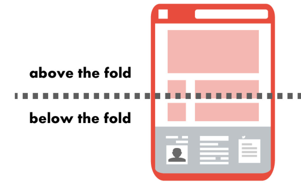
Quick history lesson: The term above the fold comes from the newspaper industry and refers to the stories printed above the point where the newspaper folds in half. Online, above the fold refers to everything that the visitor can see on your website before scrolling down. Since this is the very first (or last) thing a potential buyer can see, we want to get straight to the point and tell them exactly what they’ll get by staying on our website.
Without a strong offer above the fold, prospective buyers don’t know why they are on your site and what you are going to help them with. This often is the reason why visitors don’t spend much time on a website which results in fewer conversions.
To avoid confusion, it’s important to note at this point that an ‘offer’ is not to be confused with a lead magnet or a call-to-action (which we cover later in this article), it’s an offer to solve a problem or add value to your ideal buyers.
Customers need to see what’s in it for them as soon as they read the text. The text should be short, stand-out and avoid ambiguous fluff that could apply to ANY other industry.
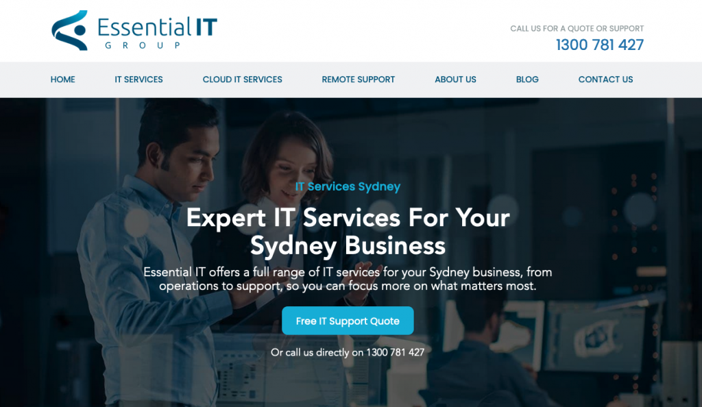
Here’s an example of ambiguous fluff with a weak offer:
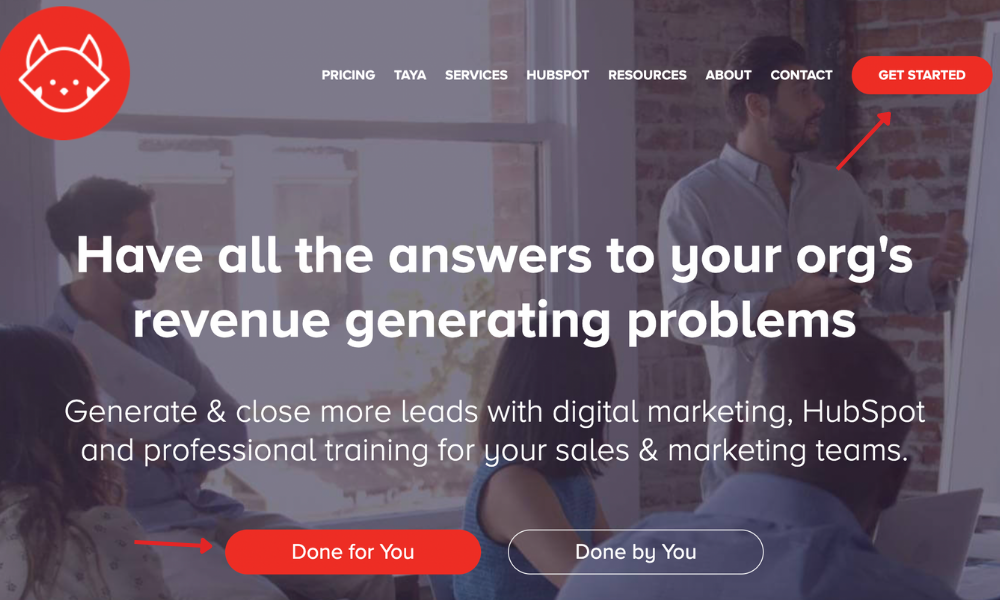
Here’s an example of a business in the same industry but with a STRONG offer:
The two examples are in the same industry and rank right next to each other for the same Google search but who do you think wins the next click – the one that has an offer that could apply to any business on earth or the one that is specific and seeks to solve a problem?
Now let’s talk about how to make your offer even better.
Every offer we use above the fold should do one (or multiple) of the following:
- Promise an aspirational identity
- Promise to solve a problem
- State exactly what they do
Promise an aspirational identity
We want to promise our customer that they can achieve their ideal identity. Can we help our customer become competent in something?
Think about how your buyer might transform for the better after working with you. Spell this out. An example for a cooking school might look like ‘Become a Pro in the Kitchen’.
Promise to solve a problem
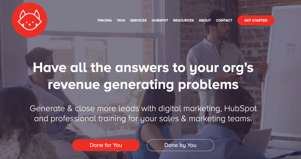
If you can solve a problem, make it clear. We want to make sure we’re making both the problem and the solution clear. A good example of this is the RedPandas example of offering to solve an organisation’s lead generation problems.
State exactly what they do
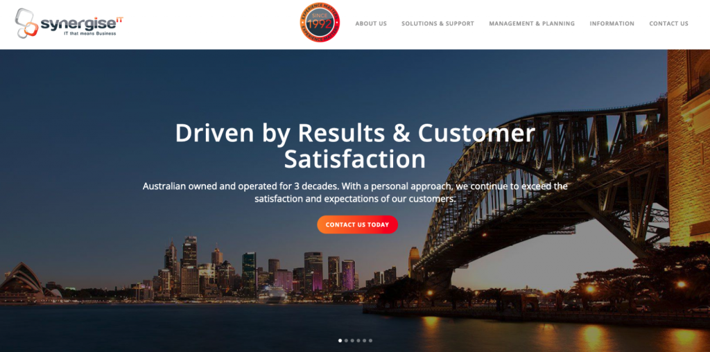
Tell your customer exactly what it is that you do. Be as simple as possible. The second IT services business above is a great example of this.
Utilise Two Direct Call to Action Buttons Above the Fold
We want to use two call to action buttons in two separate and specific spots on our website. These buttons should reflect our main desired action or product/service.
One button should be placed in the top right corner of the above the fold section, while the other button should be placed at the centre towards the bottom. This guides the user’s eyes in a “z” pattern and ensures that your call-to-action buttons cut through the noise.
You can also include a second button in the centre towards the bottom if you have a secondary offer – if you do this, make sure that the button stands out less than the other two call to actions.
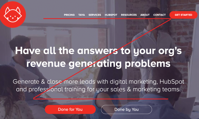
On top of this, you will want to make sure that your call-to-action buttons are different colours to everything else above the fold so that they stand out and create contrast.
Images Of Success

The images we use on our website should not be meaningless but should instead evoke an emotional and psychological connection with our audience.
Rule of thumb: Does an image you use with your messaging evoke any positive emotion? If not, remove it. It’s rubbish.
Moby Siddique, CEO @RedPandas
We want to convey to our audience that they can trust us to help them solve their problem. We want to portray feelings of satisfaction, wellbeing, and happiness from interacting with our brand. The reason we want to do this is because if customers perceive our brand as leading to a positive emotional destination, then they’re more likely to want to buy from us.
The question is, what images help us achieve this effect?
We should aim to use images that show the success of our brands products or services. The easiest way to do this is to show happy customers.
Images of people smiling and of people using our product/services is the quickest hack to evoke positive emotions and portray this message. You want to be careful not to overdo it so that it doesn’t seem ingenuine, but at the same time you want to ensure you effectively convey the message.
Bite-sized Breakdown of Revenue Streams
Sometimes it may seem difficult to accurately convey to customers what products and services you sell, especially if you have a wide range or if they seem somewhat unrelated or are very different from each other. If this sounds familiar, you’re not alone.
The solution if you have such a diverse set of products/services is to first find an overall umbrella message that unifies your various streams. So, for example you could have an umbrella message on the homepage and different sections on that page for various streams. Clicking on a section could bring up a new page with a different, more personalised offer that does not conflict with your umbrella message.
Using an umbrella message and linked offer messages is a common tactic employed by multinational brands like Unilever and Nestle but can be employed by much smaller, diverse businesses.
Use Very Few Words
Generally speaking, people scan websites, they don’t read them. Sure, if a customer sees an informative blog on your website, perhaps they will pay more attention, but even then, scanning is common. As a rule, for the rest of your website, you want to use few words.
Keep your copy short, punchy, and to the point. The fewer words you use, the more likely users will read it.
How can we do this? Here are some tactics you can use to keep text short on your website:
- Use “read more” links in sections where you want to include longer copy, so that you don’t bombard users but still provide the option to read more.
- Replace a paragraph/s with image/s and videos
- Reduce whole paragraphs into three or four bullet points
- Summarise sentences into bite-sized soundbites
- (See what we did here? Hehe)
That’s it, folks!
And there you have it, the five things you absolutely must include on your website if you want to generate success are:
- Have an offer above the fold
- Utilise two direct call to action buttons
- Images of success
- Bite Sized Breakdown of Revenue Streams
- Use Very Few Words
If you’re looking to generate revenue through your website, you might want to learn about how to write articles that rank and generate leads.

Get the best content marketing insights right in your inbox!
Subscribe to our Newsletter and get marketing insights delivered to your inbox every week.